Throughout my internship, I collaborated with the company’s BI specialist and fellow intern on the development of an annual report for Vitec Visiolink. My primary responsibility was the visual aspect of the report, including creating and designing data visualizations that effectively represented the findings and data presented in the report.
Role: UX/UI Designer Intern
Context: Internship at Vitec Visiolink
Team: BI specialist · BI intern · Product manager · Customer success manager · Digital designer
Deliverable: Annual Report
Focus: Data Visualization · Visual Design · Information Design
Tools: Figma · Looker Studio
An annual report brings together a large amount of information, ranging from business performance to user and product data. The challenge was to present this information in a way that was both visually engaging and easy to understand, without compromising the accuracy of the underlying data.
The report was based on six months of data from 2,400+ newspapers and magazines, collected across Vitec Visiolink’s digital publishing platforms. The dataset covered user engagement, commercial performance, and content consumption.
The data came in many forms: users, sessions, events, session duration, clicks, impressions and CTR, broken down by device, platform, country, content type and time. Examples included comparing engagement across mobile, desktop and tablet, measuring advertising performance for Hotspots and Interstitials, and exploring how features such as podcasts and text-to-speech affected user behaviour.
My role was to translate this variety of data into clear visual stories. Working alongside the BI specialist, my role was to turn the analyzed data into clear and engaging visualizations. I explored different ways to communicate comparisons, percentages, trends and relationships, making complex data easier to understand at a glance.
The process of creating the data visualizations involved accessing the data through Looker Studio, where I was able to use the available insights and findings as a starting point for exploring different ways of representing the information.
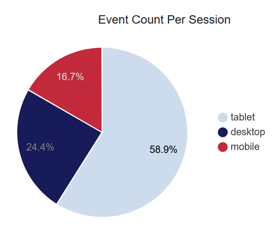
Looker Studio provided a starting point for exploring the data, but offered limited flexibility in terms of chart customization and visual styling. This made it difficult to fully adapt the visualizations to the report’s intended visual identity.
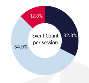
The visualization was recreated and refined in Figma as a doughnut chart, allowing greater control over its appearance and presentation. The chart was designed to clearly communicate the objective of the data, while using Vitec Visiolink’s branding colors and typography to create a more cohesive visual language.
Exploring the options:
One of the most engaging parts of the project was transforming the initial data representations into visualizations that could communicate the findings more clearly. This can be seen in the example below where the initial visualization, provided by Looker studio, was number heavy and needed to communicate the data in a more clear way.
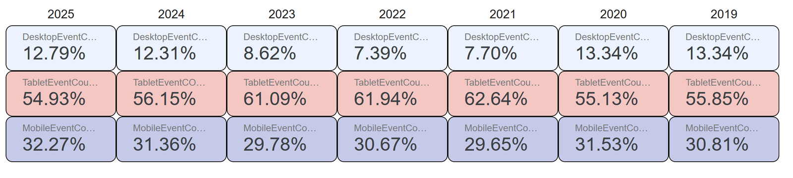
As a way of displaying device event counts across the years, Looker Studio presented the data as a grid-like table. This made it difficult to identify patterns and compare the distribution of device usage over time, resulting in a confusing visualization.
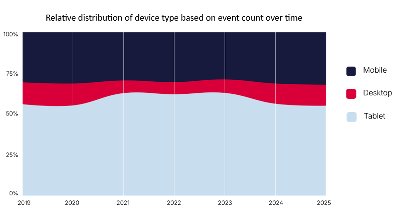
To translate the data into a more coherent visual story, I divided each year into a ‘bar’ and calculated the position of each device according to its percentage of the total event count. I then represented the data as a stacked area chart, making the relative distribution of device usage across the years easier to see and compare. This helped better express the fluctuations in customer volume and differences in data across years.


An important part of the process was creating a visual language consistent with Vitec Visiolink’s identity. The color palette for the visualization style was based on the company’s branding colors, with contrast considered to ensure readability. For example, the dark blue and red backgrounds required white text for sufficient contrast, while the lighter blue could use the dark blue as its text color. The use of dark blue instead of pure black also helped create a softer visual contrast, reducing potential eye strain and maintaining a more cohesive visual style.
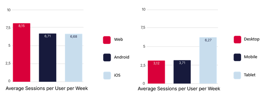
To create consistency throughout the annual report, I used color to establish a clear connection between each device and its corresponding platform. Desktop and web were represented in red, mobile and Android in dark blue, and tablet and iOS in light blue. This consistent color coding made it easier to recognize and follow each device category across the different visualizations.
The project was a close collaboration between design and data. The BI specialist provided expertise around the underlying data and findings, while I focused on translating those insights into visual forms via Figma. Working together meant continuously balancing data accuracy with clarity and visual communication.This was supported by weekly meetings with a product manager, who provided feedback while also acting as a representative of the report’s audience. Their critical questions about the data and its visual representation helped us refine how the findings were communicated and ensure that the final report was both accurate and easy to understand.
After the different visualizations had been explored and refined, they were brought together in the final annual report. Seeing the visualizations in their final context also showed how the individual design decisions contributed to the overall visual storytelling of the report. Below is a selection of pages from the final outcome.
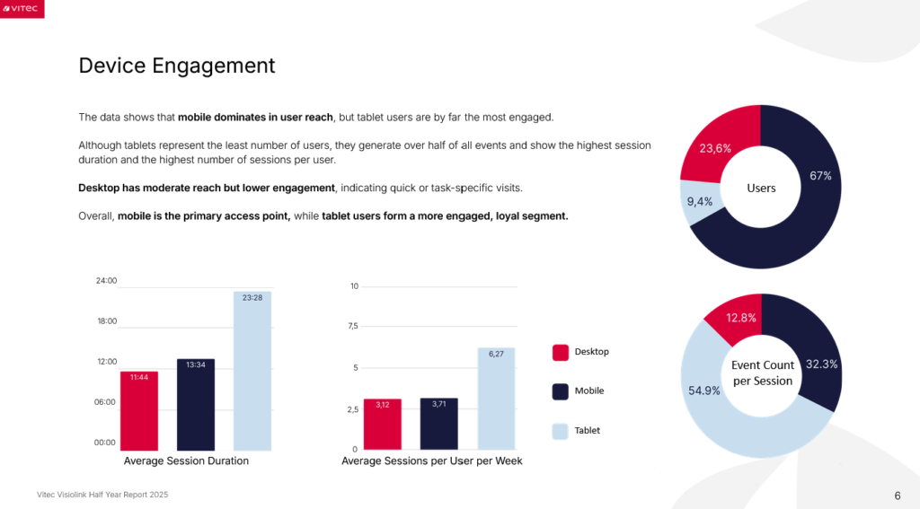
When visualising device engagement, bar charts were useful for comparing session duration across devices, while doughnut charts worked well for visually highlighting the differences in engagement between device categories.
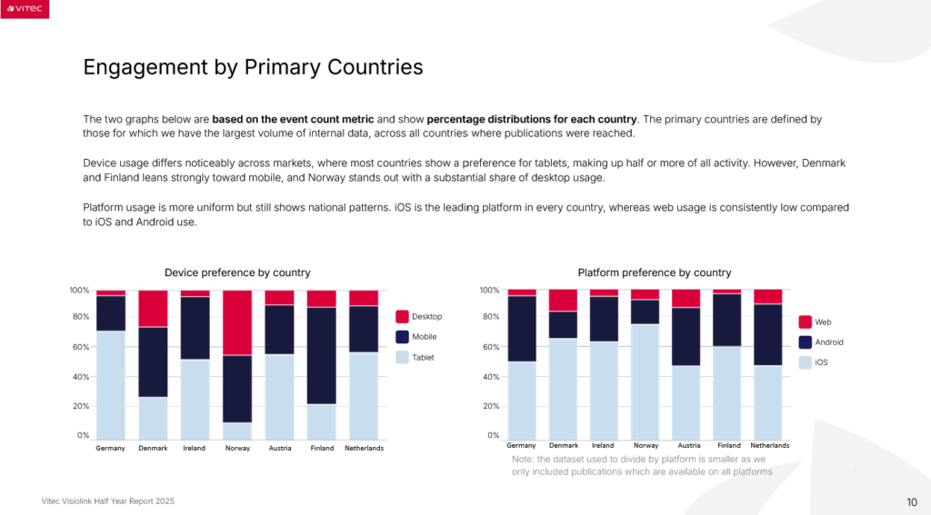
To visualize device and platform usage across different countries, I used a stacked bar chart to bring multiple categories together within each country. This allowed the seven countries to be displayed in the same visual context, making it easier to compare both the overall distribution and the differences in device or platform usage between countries.
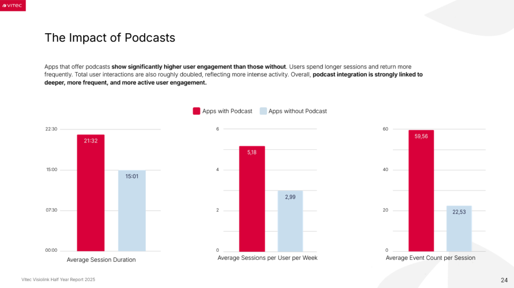
One of the aspects the management team wanted to highlight was the impact of podcasts, particularly the difference between apps with and without podcast content. As the three charts used different measures and y-axis scales, comparing the visual size of the bars alone could be misleading. To provide a clearer reference, I added the exact data values directly to the bars. This allowed the reader to interpret both the visual difference in bar size and the actual numerical difference between the categories.

Looking back on the project, I gained a better understanding of what it means to design with data. I was able to apply the critical mindset from my studies in a practical setting, questioning how data should be represented and how different visualizations could influence its interpretation. I also gained valuable experience in balancing accuracy, readability, and visual storytelling when communicating complex information. I am also grateful for the experience of collaborating with different team members. It allowed me to bring my own perspective into the project while learning from others, and made the experience both valuable and enjoyable.