During my internship at Vitec Visiolink, I was asked to conduct a usability testing on their Modular platform’s primary options for a navigational system: The ‘universe picker’ and the standard ‘bottom bar’ menu structure.
Role: UX/UI Designer · Context: Internship at Vitec Visiolink · Methods: Usability testing · Comparative testing · Prototyping · Tools: Figma
As news content has grown, the Modular platform has explored different ways to help users navigate the many content types available in e-paper apps. One solution was the “universe picker,” where the app’s top-level navigation acts as a “multiverse,” allowing users to choose between news, podcasts, live news, and more. However, Visiolink’s clients questioned whether older users would understand this concept, opting therefore for a classic bottom bar navigational structure. The project therefore tested the design with older generations of real e-paper users.
As news content has grown, the Modular platform has explored different ways to help users navigate the many content types available in e-paper apps. One solution was the “universe picker,” where the app’s top-level navigation acts as a “multiverse,” allowing users to choose between news, podcasts, live news, and more. However, Visiolink’s clients questioned whether older users would understand this concept, opting therefore for a classic bottom bar navigational structure. The project therefore tested the design with older generations of real e-paper users, with the design question becoming: Which navigation structure makes it easiest for older users to find their way through the e-paper?
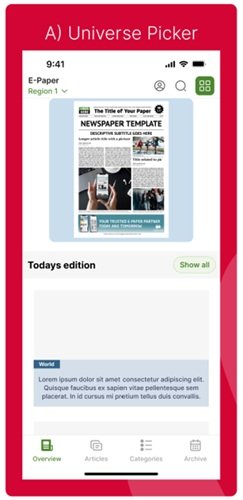
The main difference between the two navigation structures can be detected in their names: The universe picker makes use of ‘universes’ to display different types of publishing content, while the bottom bar menu uses menu tabs for displaying the different publishing content. The images below show the Figma prototypes I constructed for the upcoming usability testing.
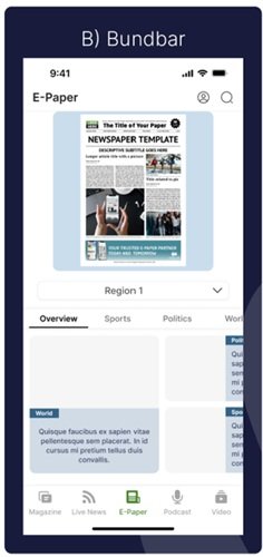
The Bottom Bar
The Bottom bar is the classic navigational structure that uses the bottom bar tabs to store content
The Universe Picker
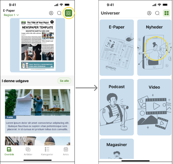
This navigational structure has a green button in the top right which navigates to the other universes. Each bottom bar tab is custom to the specific universe it belongs to
With two fundamentally different ways of organising the same content, we needed to understand how they performed with the older generation of users.
To answer the design question, I tested both navigation concepts with real e-paper users. The research combined usability testing, SUS scores, and interviews to understand how easily users could navigate each structure and where they experienced friction.
WHAT
- Usability testing of both navigation structures
WHO
- Regular e-paper readers
- 50 – 80 year olds
- Consumers of one particular digital e-paper product
HOW
- 🤖Prototypes: The testing apps were built as high-fidelity prototypes in Figma, which was considered sufficient for this internship project.
- 📋 Tasks: Participants completed four tasks designed for each prototype, focusing on the differences between the two navigation menus.
- 📊 SUS scores: A ‘system usability survey’ (SUS) was included to measure the two prototypes in relation to use, confidence, learnability and complexity.
- 🎙️ Interviews: Post-testing, I interviewed the participants about their experience with the first prototype and if they had any difficulties with it. I then asked about the second prototype and if there were any difficulties detected there. Finally, I asked the participants if they had a preferred model.
What were we looking for?
- How easily users understood each navigation structures
- How quickly they could find content
- Where they got confused
- Which structure was preferred and why
The research resulted in four key insights based on the usability testing, participant interviews, and SUS scores. Together, these findings highlight the strengths and challenges of the two navigation concepts.
#1 — The universe picker improved orientation:
The universe picker generally gave participants a stronger sense of overview and orientation within the app, with four of the seven participants preferring it. The concept of the universes seemed to resonate with the participants, with some describing the structure as easier to understand because it allowed them to see and move between the different universes. Overall, the findings suggest that the universe picker can support users in understanding the larger structure of the app, particularly when the interface contains a large amount of content.
#2 — The Bottom bar playlist was hard to discover:
The clearest usability issue across the testing was the placement of the playlist, detected in the bottom bar navigational structure. Four out of seven participants had difficulties finding it. The playlist was located behind the user icon in the sidebar, which did not match participants’ expectations because most other features were directly discoverable within the main interface. This observation highlights a usability issue with the placement of the playlist within this navigational structure. It should be made more visible and accessible in a future iteration.
#3 — Familiarity influenced preference:
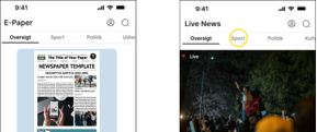
The bottom bar was preferred by some participants because it resembled navigation patterns they were already familiar with. However, familiarity did not consistently translate into easier navigation. Participants in Group B reported difficulties with the categories in the top bar, while they found it easier to complete the tasks using the universe picker. This indicates that a familiar pattern may therefore feel comfortable, while a different structure can still provide a clearer overview and better support task completion.
#4 — The universe picker showed the strongest overall performance
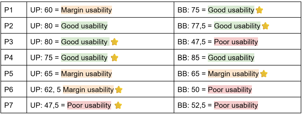
The SUS results support the qualitative findings, with the universe picker receiving a total score of 470 compared to 452.5 for the bottom bar. Three participants rated each prototype within the “good usability” range, showing that both concepts performed relatively well. However, the universe picker received both the higher overall SUS score and the preference of four out of seven participants. While the difference is not large enough to establish a definitive winner, the results do indicate that the universe picker has a stronger advantage in relation to orientation, especially when it comes to apps with larger contents.
Looking back at the project, the process gave me valuable insights into how I approach research, testing, and external stakeholder collaboration.
A. Testing is more than observing tasks:
One of my biggest learnings was the importance of creating the right conditions for user testing. Due to a limited timeframe, I had all participants perform the tasks at the same time. This made observing the participants closely, and exploring their thoughts in depth, very difficult. This reminded me that good usability testing is more than having the right questions or tasks, because it is important to have the right time and flexibility to follow up on interesting observations that may arise. For future projects, I would prioritise more time for observation and follow-up questions.
B. Bringing stakeholders into the process early:
Working with an external stakeholder also taught me the value of early alignment. Changes to the timeline and participant recruitment made the testing process more challenging than expected. Looking back, I would involve the stakeholder earlier once the main research requirements were defined. This would create a clearer shared understanding of what was needed for the testing and leave more room to adapt the process when things changed.
C. Taking findings forward:
Although the universe picker performed slightly better, I don’t see the result as simply choosing one concept over the other. The testing gave me a better understanding of what worked, what created friction, and what needed further exploration. My main takeaway is that research should help move the design forward rather than simply prove that one solution is better. The next step would therefore be to take the strongest parts of the concepts, improve the discoverability of features such as the playlist, and test the experience again with a broader focus.
To round off my internship, I presented the research, findings, and key learnings at Visiolink’s Speakers Corner. It gave me the opportunity to share the project beyond the immediate team and communicate how the research could contribute to the future development of the Modular platform.