This project spanned an entire semester during my bachelor’s degree and is worth highlighting in my portfolio, as it covered the full UX/UI design process.
During my 4th semester of Digital Design, I worked on a group project exploring the theme of surveillance and care. This sparked a conversation within my group about how one’s online presence on social media can be a tricky road to navigate within, and how difficult it can be to control that presence, or the lack of. Following that, we decided we wanted to move along with this topic and explore how digital design could help shape one’s online and offline presence.
When being online becomes being available
This process started with discussions, among ourselves, about how it has become normalized to monitor people’s online activity, which moved to how different platforms communicate different types of availability. For example, on Snapchat, a person’s activity can be inferred through things such as their Snap Score or location, while other platforms may simply indicate whether someone is currently online or when they were last active. Although these features are designed to support social interaction, they also make a person’s availability visible in ways they may not always be consciously aware of.
This raised a question for us: how much control do users actually have over the way their online presence is communicated to others? With people using multiple platforms, each with their own ways of displaying activity and availability, managing this presence can become difficult. We therefore became interested in designing a way for users to have greater control over how they appear online.
To understand how people experienced this issue, we conducted 11 interviews with people aged 18–30. Rather than assuming that everyone viewed online monitoring as a problem, we wanted to understand the different attitudes people had towards it.
What we found: People had very different attitudes towards online visibility.
Some participants saw monitoring each other’s activity as a normal part of social media, while others were more conscious of privacy and felt that platforms sometimes took control over how their availability was communicated.
One recurring theme was loss of control. Some participants felt that platforms could make them appear available when they weren’t, or required them to manage their visibility separately across different platforms. This became the key insight that shaped our design:
The problem wasn’t necessarily that people were being monitored — it was that they didn’t always have control over how they were represented online.
Our research revealed two different attitudes towards online visibility. Rather than treating one as the “right” way of using social media, we created two personas to represent these perspectives and help us consider the needs of both throughout the design process.
Dave — The privacy-conscious user
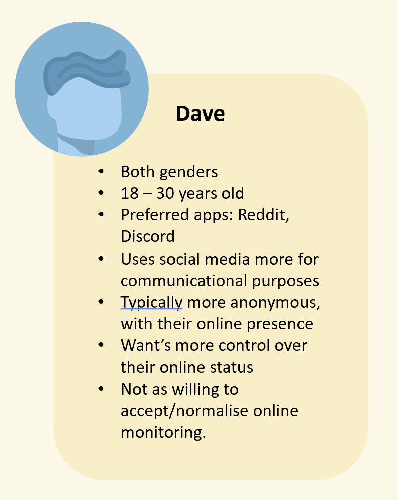
Dave represents users who are more critical of how social media exposes their online activity. He values privacy and wants more control over how his availability is communicated to others.
Sam — “The name of the game”
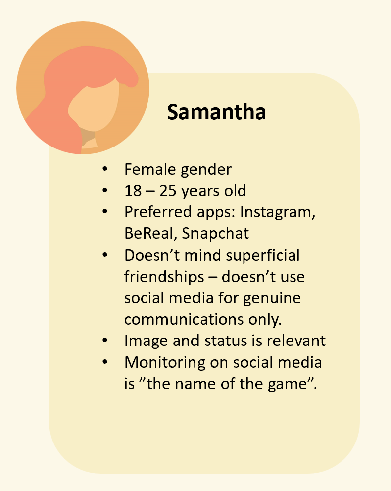
Sam represents users who are more comfortable with online visibility and see checking activity and availability as a natural part of social interaction.
While the two personas had different expectations, our design focus became centered around Dave’s need for greater control over his online presence. Sam’s perspective remained relevant as we considered how the product could fit into existing social behaviors rather than trying to change them.
Based on our research and the persona ‘Dave’, we decided to create and design one place for managing your online presence.
This is where Indigo was born: A concept for a desktop and mobile application that gives users a centralized way to manage how their availability is presented across different platforms. Instead of configuring each platform individually, Indigo acts as a control layer, giving users a single overview of their online presence. Following that, we identified four central design goals we wanted to include in the design process for the final solution:
Clarity
Make the user’s current online presence easy to understand at a glance.
Control
Give users an accessible way to change how they appear across platforms.
Simplicity
Reduce the need to navigate through multiple applications and settings.
Calm interaction
Create an interface that feels controlled and unobtrusive rather than adding more noise.
The initial prototype was constructed in Figma, as low fidelity. When we were satisfied with our initial design, we moved forward by testing it on four potential users.
The testing helped us identify several issues that weren’t immediately obvious in the first design.
#1 Navigation Challenges: Users found parts of the navigation confusing, particularly the placement of account information.
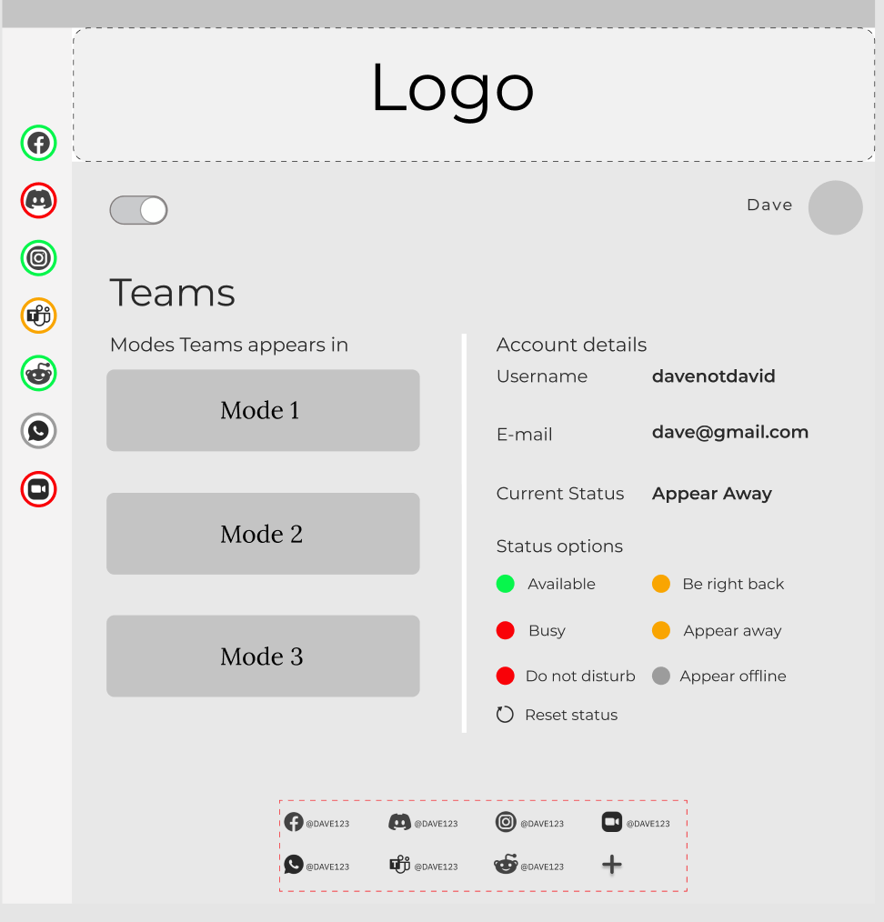
#2 Information Hierarchy: They also expected a clearer way to return home and suggested changes to the hierarchy of information on the platform pages.
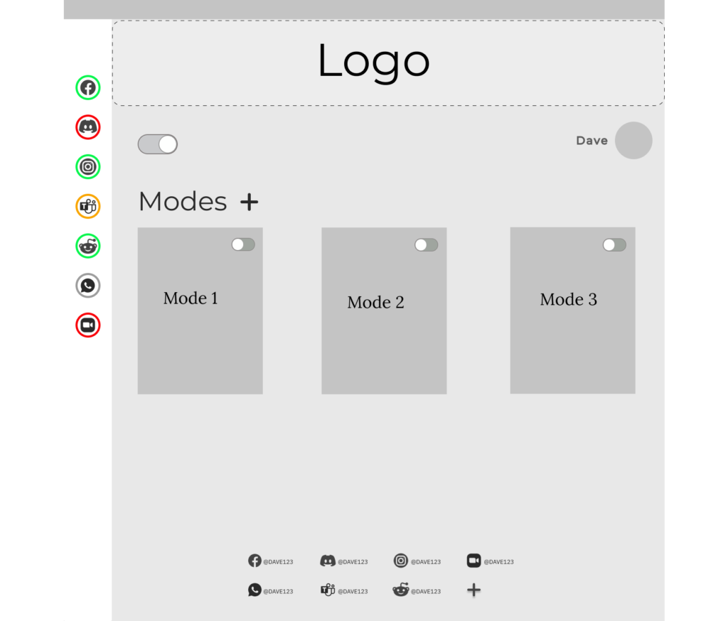
For this part of the process, the user testing stands out as an important reminder of the gap that can exist between design intention and user experience. This stands out as one of those ‘aha’ moments during my studies where we as students started to recognize how easy it is to become immersed in the design process that we overlook the basics, like to add a ‘home’ button
The feedback helped us uncover assumptions, and we used them to iterate on the interface, restructuring the navigation, moving account management into settings, and refining the interaction patterns.
For the final concept, we decided to include both desktop and mobile prototypes, allowing users to manage their online presence across devices.
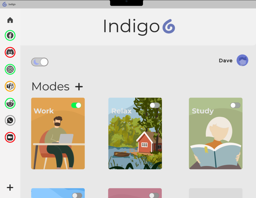
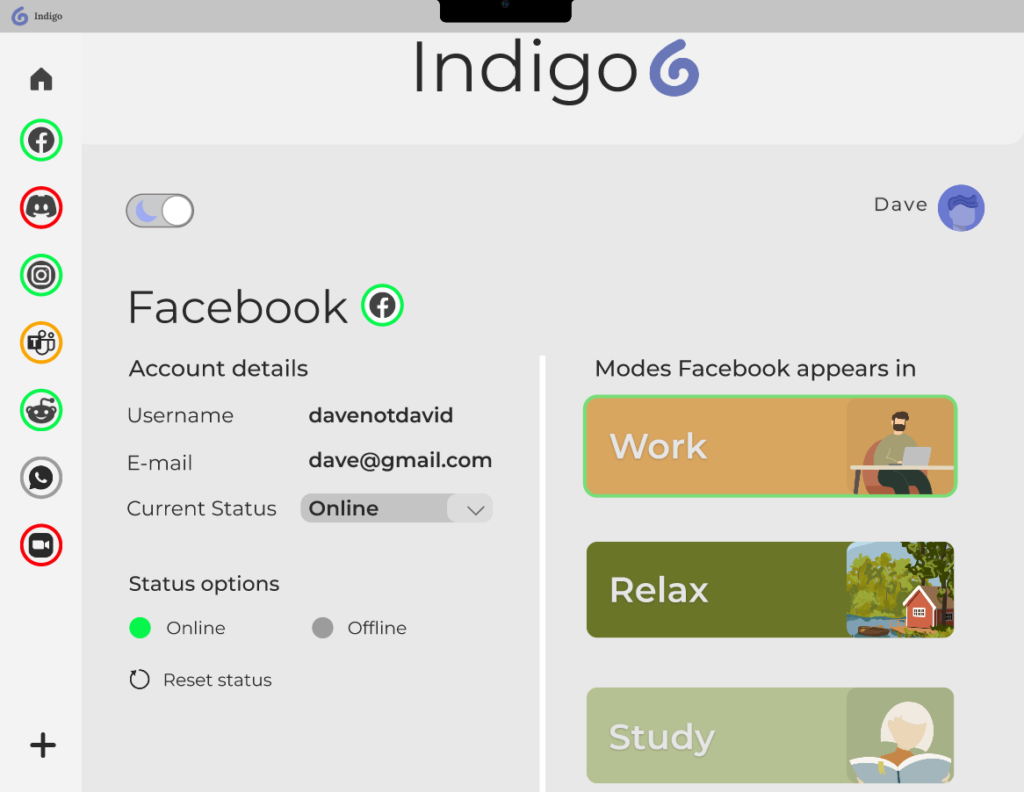
Try it yourselves
These prototypes were made available for people to try themselves when we were displaying the project during a ‘Design Expo’, held at Katrinebjerg in 2022. And the good news are that they are still available online.
My contribution
As part of the study group, I worked across the UX/UI process, including:
- User research & interviews
- Research synthesis
- Persona development
- UX & information architecture
- Interaction design
- UI design
- Figma prototyping
- User testing
- Iteration
At the time, this project was a huge learning curve for us as we worked through the process of research, design, and developing a final solution. This is also where I fell in love with Figma as a prototyping tool, and since then I’ve further developed and streamlined my design skills within the software.
Looking back: This project taught me how much can change when you move from assumptions to research and user feedback. Looking back today, I would spend more time validating the problem space before moving into a solution, and involve users more continuously throughout the process rather than primarily during testing. This is something I carry with me today: treating design as an iterative process of asking questions, challenging assumptions, and learning from the people I’m designing for.